Shadcn UI
Online
Beautifully designed components that you can copy and paste into your apps. Accessible. Customizable. Open Source.
Last Updated: 2025/5/24
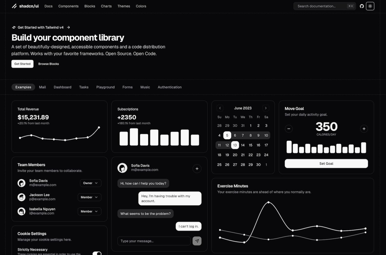
Website Preview
Detailed Introduction
shadcn/ui – Build Your Own Component Library with Copy-Paste Flexibility
What is shadcn/ui?
shadcn/ui is an open-source platform that provides a collection of beautifully designed, accessible UI components. Unlike traditional component libraries that offer pre-packaged components, shadcn/ui allows developers to copy and paste component code directly into their projects. This approach offers greater flexibility and customization, enabling developers to tailor components to their specific needs.
Why Choose shadcn/ui?
- Open Code: Access to the full source code of components allows for complete customization and understanding.
- Composable Design: Components are built with composability in mind, making them easy to integrate and extend.
- Framework Agnostic: Works seamlessly with popular frameworks like Next.js, Vite, Laravel, React Router, Astro, and Gatsby.
- AI-Ready: The open and consistent API design makes it easier for AI tools to read, understand, and even generate new components.
- Tailwind CSS Integration: Leverages Tailwind CSS for styling, providing a utility-first approach to design.
Core Features of shadcn/ui
- Component Library: A wide range of components, including buttons, forms, modals, and more, ready to be integrated into your project.
- Blocks and Examples: Pre-designed blocks and examples to help you get started quickly.
- CLI Tool: A command-line interface to add components to your project efficiently.
- Monorepo Support: Enhanced support for monorepo structures, simplifying component management across multiple packages.
- Dark Mode and Theming: Built-in support for dark mode and easy theming options to match your brand.
How to Get Started with shadcn/ui?
- Visit the Website: Go to shadcn/ui to explore available components and documentation.
- Install Dependencies: Set up your project with necessary dependencies like Tailwind CSS.
- Use the CLI: Utilize the shadcn CLI to add components to your project.
- Customize Components: Modify the copied component code to fit your project's requirements
Tips for Using shadcn/ui
- Leverage Examples: Explore the Examples section to see components in action and understand their usage.
- Stay Updated: Keep an eye on the GitHub repository for updates and new components.
- Community Engagement: Join the community discussions to share insights and get support.
Frequently Asked Questions (FAQ)
Q: Is shadcn/ui free to use?
- A: Yes, shadcn/ui is open-source and free to use under the MIT license.
Q: Can I use shadcn/ui with any JavaScript framework?
- A: shadcn/ui is designed to be framework-agnostic and works well with frameworks like Next.js, Vite, Laravel, React Router, Astro, and Gatsby.
Q: How do I customize components?
- A: Since you have access to the full source code, you can modify the components directly to suit your needs.
Q: Does shadcn/ui support dark mode?
- A: Yes, shadcn/ui has built-in support for dark mode and theming options.
Q: Where can I find documentation?
- A: Comprehensive documentation is available on the shadcn/ui website.